Signage requirements
The following guidelines relate to project signage developed to acknowledge the receipt of NSW Government grants and subsidies.
Acknowledgement statement
The funding acknowledgement statement must be included on project signage. Department names and department-specific taglines should not be included.
Acknowledgement approval
Your funding scheme manager must approve final artwork (ensuring it meets corporate identity requirements) prior to production.
Logos
The NSW Government logo should be of sufficient size to allow easy recognition and readability, considering the type of sign, its positioning and visibility.
The NSW Government logo is positioned top right when it appears on its own or with a joint partner logo. See Signage guidelines section for correct positioning of partner logos.
Typeface
Public Sans is the preferred typeface for signage.
Text size should be proportionate to the entire signage design as per guideline and be clearly visible and legible.
Capitalisation
The NSW Government’s corporate identity policy is to use minimal capitalisation.
Capitals should only be used for the first letter of the first word of a sentence and for names of particular people, places and things (proper nouns).
Size
Refer to the Signage guidelines section for signage sizes.
Clear space
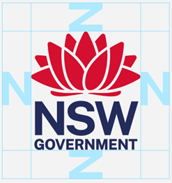
Clear space must be maintained around the logo which is no less than the height of the "N" of NSW that forms part of the logo.

Logo colours

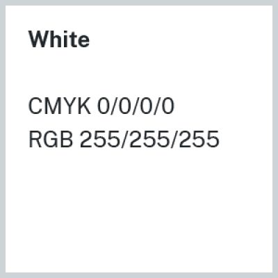
White
CMYK 0/0/0/0 or RGB 255/255/255

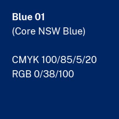
Blue 01 (Core NSW Blue)
CMYK 100/85/5/20 or RGB 0/38/100

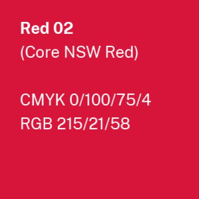
Red 02 (Core NSW Red)
CMYK 0/100/75/4 or RGB 215/21/58