Why redesign?
“Living in NSW” covers a broad range of topics, relevant to all NSW residents.
The previous version of the page was overwhelming and confusing:
- Content was text-heavy.
- There were no visual elements to help users differentiate between sections.
- We did not set user expectations of where calls-to-action on the page would take them.
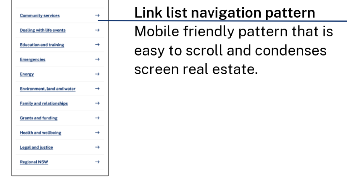
- The page required long scrolling on mobile devices.
We had the opportunity to redesign the page to provide context and visual cues.
Our three key goals were to:
- highlight commonly searched terms
- feature key content
- make it easier to use on mobile devices.
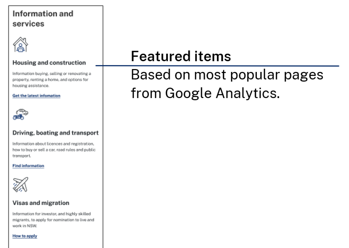
We used heat maps as part of the initial research to understand where customers were looking and clicking across the page. We learned which content captured attention, and what wasn’t working so well. Through analytics, we found that three topic areas accounted for over 70% of all page clicks. These insights helped us highlight content that was most important to customers on the page.
Key features of the redesign
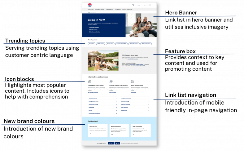
One challenge of the “Living in NSW” page was the number of links to click on and their lack of hierarchy on the page. The updated page now calls out the information that customers are most likely to search for and visit.
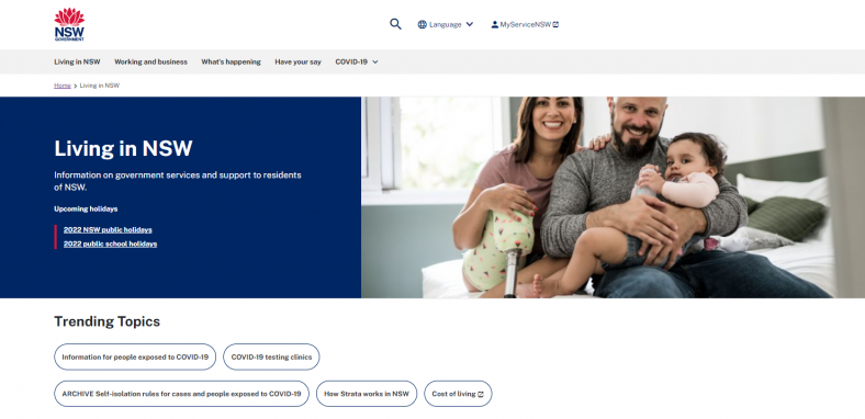
The trending topics module serves content based on customer trends. The tags use customer-centric language. This bridges the gap between official terminology and keywords people use when they are searching online. For example, ‘How strata works in NSW’ is more descriptive as a call to action versus the topic 'Strata'.
A feature box can promote topical content, such as news or upcoming events from other areas of nsw.gov.au.


